Portable Network Graphics vs Transparency Gradients

With new beginnings come, new challenges arise. Although mine were relatively minimal, ive been wondering;
a) how / when to use PNG formatted images
b) how to implement transparency and gradated transparencies
and then i found an opportunity today at work.
Wilst working on an entirely different project, i discovered that this wonderful little illustration was actually quite grotesque and needed at least a little purple and a little green to add that little je'ne sais pas. A bit of stroking, miter editing, a few tutorials later, a call to Mother for technical support (as in, my mother), two screen calibrations, a workspace settings update and VOILA! Complex transparencies (both 100% and gradated) + vector art = happy times!
Praying Zombie Hands of Heaven!
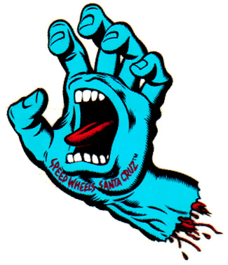
(im pretty much thinking the image was based on / inspired by (subconsciously, of course) Ray Frendens exquisite touch (and monster-ific color combo's), the "Hulk" NewEra colorway (not to be confused with the joker colorway, which uses a lighter "less-angry" green), matt (baddesigners) lfgss / lcef first birthday burning finger image, the santa cruz burning hand and squidfires zombie t.)

ray frendens monstervision

new era hulks out

bibby gets result (again)

a classic

a new classic


Post a Comment
<< Home